


The brand was developed through a thoughtful, research-driven approach, grounded in an understanding of youth leadership and the communities it serves. By exploring the program’s impact and the experiences it provides, the identity was shaped to reflect confidence, growth, and connection.
The visual direction focuses on energy, movement, and inclusivity. Bold, dynamic elements were balanced with a clear and structured system to create a brand that feels both engaging and accessible. The result is an identity that resonates with youth while supporting a strong and recognizable presence across communities and programs.

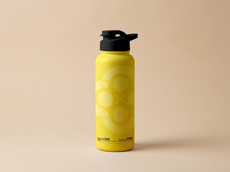
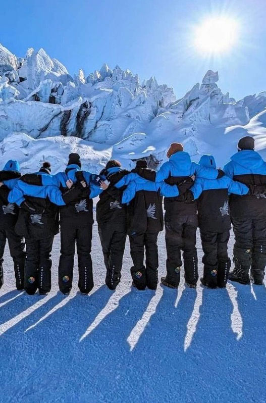



The YAP NWT logo is rooted in connection, strength, and shared purpose. The circular form represents youth across the North, united through the program and connected across communities. Within the mark, bold interlocking lines symbolize strength, support, and the relationships built through shared experiences.
The composition is designed as an aerial view, looking down at youth coming together as one, reinforcing a sense of unity and collective direction.
At the centre, the “X” acts as a focal point, representing connection, meeting place, and the intersection of paths, where individual journeys come together through a shared purpose.
The colour palette is drawn from the territorial crest, grounding the identity in place and reinforcing its connection to the Northwest Territories. Together, these elements create a symbol that reflects leadership, belonging, and the strength of youth connected across the North.
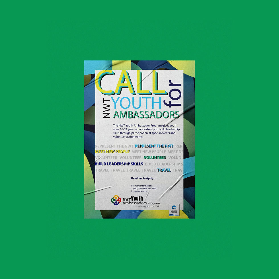


Youth Ambassador Program
YAP NWT is a youth leadership and development program dedicated to empowering young people across the Northwest Territories. Focused on building confidence, skills, and community connection, the program provides opportunities for youth to represent their communities, engage in meaningful experiences, and grow as leaders at territorial, national, and international levels.
The Approach
The approach began with establishing a clear brand strategy to define the direction, audience, and overall positioning of YAP NWT. This foundation guided the development of the visual identity, informing the selection of the icon and colour palette to ensure they reflect the energy, diversity, and spirit of youth across the Northwest Territories.
From this direction, I developed a flexible identity system designed to be implemented across a wide range of platforms and applications. The focus was on creating a brand that feels dynamic, accessible, and adaptable, supporting everything from promotional materials to digital communications.
The result is a cohesive and scalable brand that strengthens recognition, resonates with youth, and supports YAP NWT’s presence across communities and programs.
LOCATION
Yellowknife, NWT
INDUSTRY
Public Sector + Youth Development
DELIVERABLES
Brand strategy
Visual identity system