

Northern Industrial Construction
Northern Industrial Construction (NIC) is a Northern-based construction company delivering industrial, civil, and infrastructure projects across the Northwest Territories. Known for executing work in complex and remote environments, NIC plays a critical role in supporting infrastructure across Northern communities.
The Approach
As NIC continued to expand, the focus shifted to strengthening how the brand shows up across real-world applications. With a recognizable logo and strong reputation already in place, I developed a structured visual identity system to bring greater consistency, clarity, and scalability to the brand.
Built to perform across both field and corporate environments, the system supports everything from on-site applications to internal communications. The result is a cohesive and flexible brand that reflects the strength of their work while supporting continued growth and visibility.
LOCATION
Yellowknife, NWT
INDUSTRY
Commercial + Infrastructure Construction
DELIVERABLES
Brand strategy and direction
Visual identity system
Creative direction
Marketing and brand applications
Corporate templates and presentation materials
On-site and safety signage


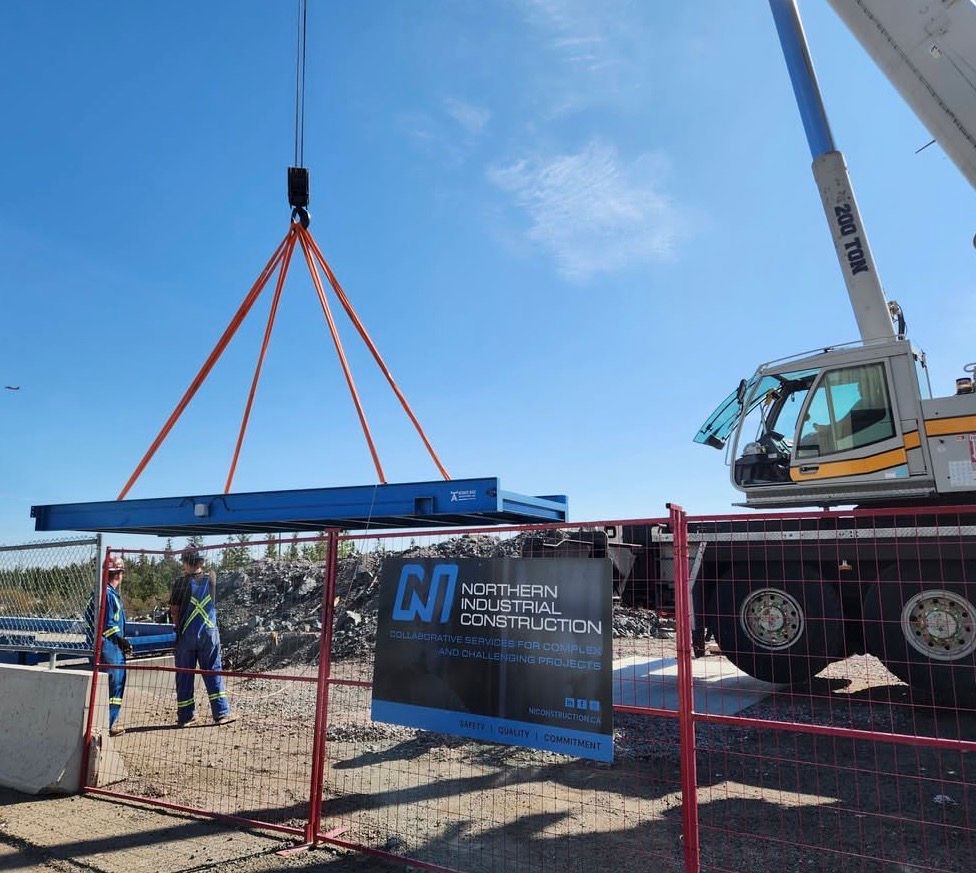
We led a full brand elevation and expansion, transforming their existing mark into a cohesive and scalable identity system. This included the development of comprehensive visual identity guidelines to ensure consistency across all communications, as well as the design and implementation of new decals, site signage, and branded applications across equipment and job sites.
The result is a stronger, more unified brand presence that reflects the scale, professionalism, and impact of NIC’s work throughout Northern Canada—both in the field and in the communities they serve.


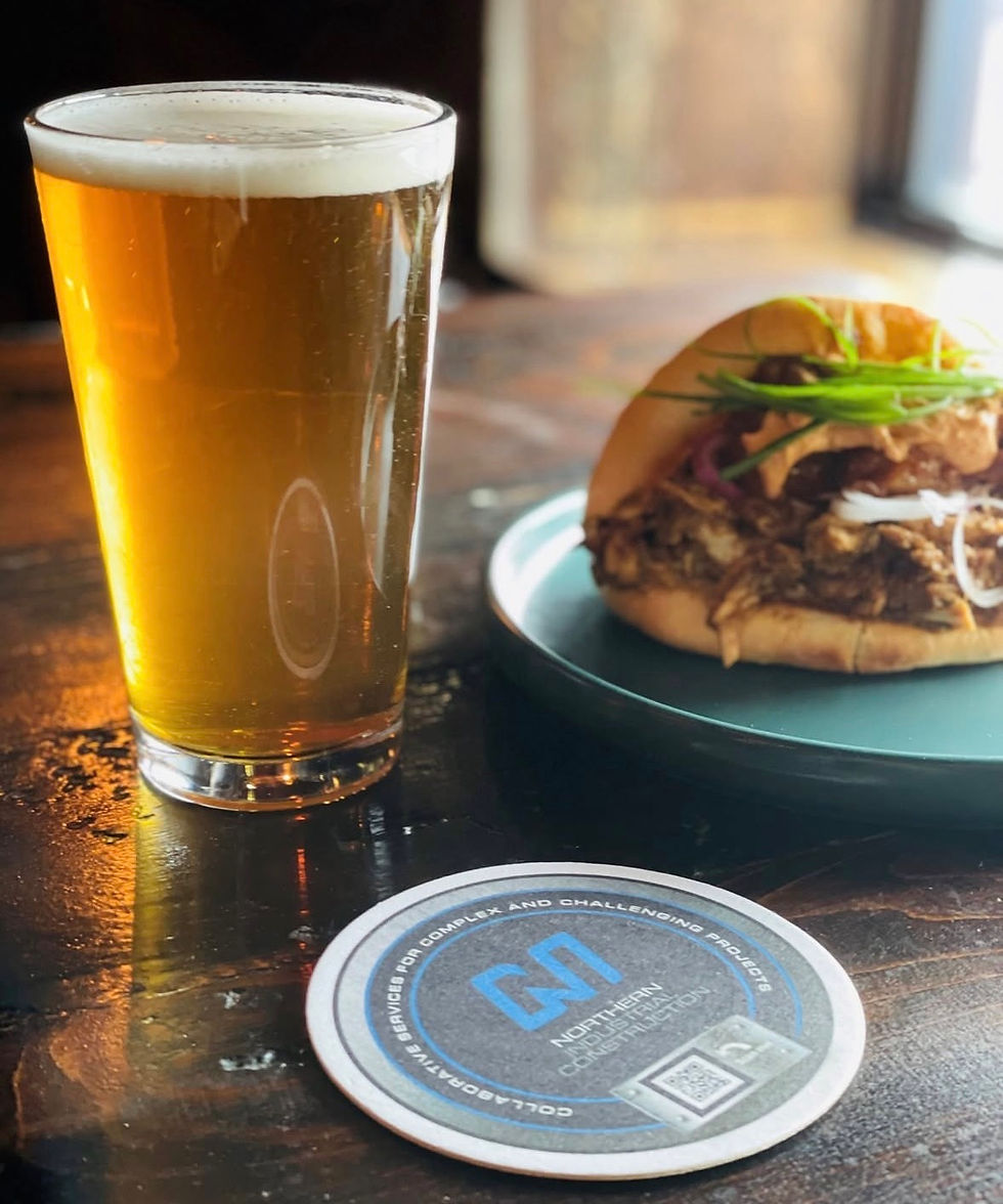

To strengthen NIC’s presence and ensure greater visibility across applications, I refined their existing logo by thickening the lettering for improved legibility and impact. I also developed black and reverse (white) versions to allow for flexibility and strong contrast across a variety of backgrounds and materials. Building on this foundation, I elevated the brand through thoughtfully designed, on-brand footers and introduced textured backgrounds inspired by the raw materials commonly found on their job sites. A deep blue was incorporated to complement their existing corporate blue, adding depth and sophistication to the overall palette while maintaining brand recognition.


Once the brand was elevated, we expanded its application across both internal and external touchpoints. This included the development of proposal templates, as well as on-site and safety signage to ensure consistency and professionalism in the field. To further distinguish NIC, we also created custom metal business cards that are truly one of a kind. These pieces not only reflect the industrial nature of their work but also leave a lasting impression, reinforcing the strength and quality behind their brand.



Testimonial
Geoff Oldfield
OPPERATIONS MANAGER
Because of Brands by Adele, we now have a strong and cohesive visual identity that truly represents Northern Industrial Construction Ltd. From our logo and color palette to typography and brand applications, everything feels consistent, professional, and aligned.
Compared to before, it’s now much easier and faster for us to communicate and maintain our brand direction with confidence. Adele was able to take what we envisioned and bring it to life in a way that exceeded our expectations. We’re incredibly grateful for her work and the impact it has had on our brand.
Northern Industrial Construction