

Northwest Territories and Nunavut
College of Nurses
CNNN is a professional association dedicated to supporting and representing nurses across Nunavut and the Northwest Territories. Focused on advocacy, connection, and professional development, the organization plays a key role in strengthening the nursing community while supporting quality care across Northern regions.
The Approach
CNNN came to me with an established logo but without a defined visual identity to support how the organization shows up across its communications. The opportunity was to elevate and expand the brand, creating a cohesive system that aligns with the existing logo while strengthening clarity and consistency.
Building from this foundation, I developed a visual identity that draws from the logo’s colours and core elements, expanding it into a flexible system. This included the creation of supporting graphics, iconography, and logo variations to ensure the brand could be applied effectively across a range of touchpoints.
The work extended into practical applications, including Microsoft templates, stationery, and PowerPoint presentations, allowing the organization to communicate with a consistent and professional presence. The result is a cohesive and scalable brand that supports CNNN’s growth and strengthens its visibility across the North.
LOCATION
Yellowknife, NWT
INDUSTRY
Healthcare + Professional Association
DELIVERABLES
Brand strategy + direction
Visual identity system development
Logo variations + refinements
Iconography + supporting brand elements
Branded stationery + corporate materials
Microsoft Office templates
Presentation templates
Brand application guidelines

CNNN came forward with a strong logo but without the visual system needed to support how the organization communicates across regions and platforms. The opportunity was to build out a brand that could carry that mark further, creating consistency while strengthening how it shows up to its audience.
The visual identity focuses on clarity and usability, ensuring the brand can be applied seamlessly across everyday communications. By expanding the existing logo into a suite of supporting elements, icons, and variations, the result is a practical and cohesive system that feels professional, recognizable, and easy to implement across the organization.




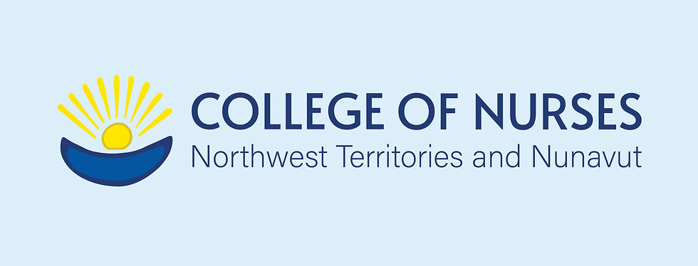
As part of the identity development, I made thoughtful refinements to the existing logo to improve balance, clarity, and readability. This included adjusting the relationship between the icon and wordmark to create a more cohesive composition. The hierarchy of the typography was also refined by reducing the prominence of the “Northwest Territories and Nunavut” subtitle, allowing the primary name to take focus and improving overall legibility. These subtle adjustments strengthened the logo while maintaining its original intent.


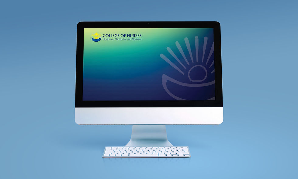
With a defined visual identity in place, the brand was able to expand seamlessly across a wide range of applications. From PowerPoint templates to corporate materials, each asset was developed to ensure consistency, ease of use, and a professional presence across all communications. This approach allows CNNN to show up clearly and confidently, supported by a brand system that is both practical and scalable.